

weird way to brag about getting a blowjob in the parking lot but whatever i guess
So now American corporations have to get permission from MAGA to change their logo?
I’m about to expand my business from a tourist city to a big HCOL city, and I want to rebrand it in the new city, with a new name and logo. Do I need to apply for MAGA permission first? Does Don Jr have to sign off first?
What exactly are they pissed about? Yeah, the new design looks like ass, but what’s woke or even political about that?
It’s a day ending in Y, and they needed their daily outrage, so they can get their Dopamine fix.
The CEO is a woman! WITH GLASSES!!!
Woke is anything you don’t like.
I’m confused. The new logo is great, or it’s shit, I don’t care. But what does it have to do with wokeness? Did the old man sitting by the barrel start sucking dick on the billboard? Has he transitioned? Does the new logo secretly spell out black lives matter in invisible ink? It’s just the name in a sort of blob? How is this political? What am I missing here?
But what does it have to do with wokeness?
See this handy guide for the way these dipshits think.
Woke doesn’t mean anything specific more, it just means “thing I don’t like.” So when somebody says they want to end wokeness, they mean they want to remove everything they don’t personally approve of.
Snowflakes getting their feelings hurt because pictures change
Perhaps he feels the original logo depicted a white cishet male, and thus the new one is erasure.
Come-on everybody knows that barrel is full of dildos pickled in anal lube.
No, that would be my nightstand drawer
and where might i find a cracker barrel so i can know to, uh, avoid it and get directions away from there.
They took the orange man off their logo. This is obviously a statement against Trump and therefore woke.
What a pathetic fucking culture.
Super pathetic.
“Anything that I don’t like is woke” word has lost meaning.
That wasn’t Jesus in the parking lot, man.
Sure it was. But it’s spelled Jesús, and he was just an immigrant trying to make a better life for him and his family back home in Mexico.
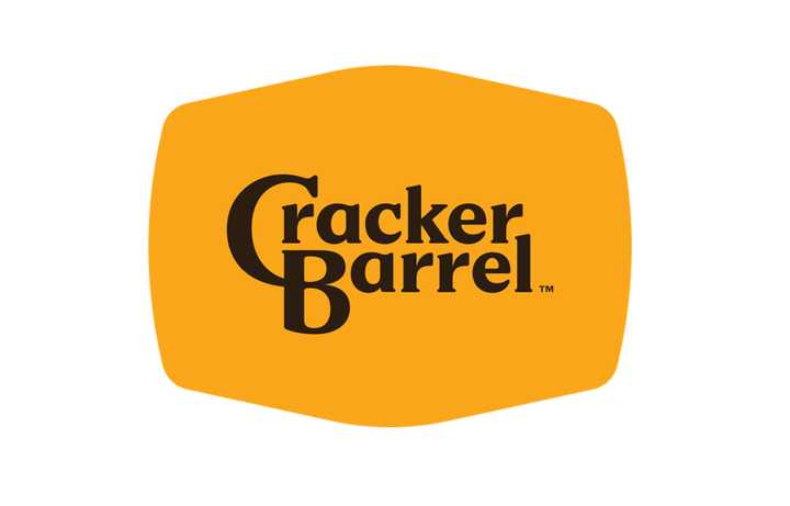
The new one
Ugh I can just SMELL the WOKENESS. If I look at this ANY LONGER I might be AWOKENED
What? How is this any « woke » even for the MAGA lunatics ??
Anything they dont like is “woke”

They had a DEI/nondiscrimination campaign because of several high profile stories where restaurants were accused of racism (black diners being asked to move away from seats visible from the entrance, at least one black person being told “we don’t serve your kind” or words to that effect.)
He was right. Jesus would never tolerate this. Time to flip some barrels.
It’s on like Donkey Kong!
Tbf the old logo is much better
It’s following the modern trend of flat clean lines. I’m getting rather sick of it TBH
soulless minimalism
I absolutely hate basically everything about modern logos and UI design. It looks like shit, and for UIs it’s not even efficient usually.
It’s better in some ways, worse in others. It’s shit for a thumbnail, for example. The old one stand out more, but the new one is more readable and fits into any format.
Yeah, I think so too. I don’t see why they had to change the font, at least the C had character. Now it’s the most boring plain forgettable font imaginable and black at that. It’s like they didn’t even try.
I mean, it’s less visually noisy, but that’s it?
This dude’s willing to go to arms over this?
It makes the size of the logo versus the text look like nothing but wasted space. Hell, versus the text portion, it looks like MORE extra space is used than the old logo, ony with zero charm or familiarity to show for it.
If they wanted to re-brand as a truck-stop, merge with Love’s, don’t just rip-off their color-scheme minus the Heart.
Lmao they got rid of the cracker and the barrel
The barrel is still there. The background is a barrel.
I thought it was a cracker.
The new one makes the size of the logo versus the text look like nothing but wasted space. Hell, versus the text portion, it looks like MORE extra space is used than the old logo, ony with zero charm or familiarity to show for it.
If they wanted to re-brand as a truck-stop, merge with Love’s, don’t just rip-off their color-scheme minus the Heart.
Traitor.
Not all skinfolk are kinfolk if thats what your gettin at
They are so upset by the dumbest, most asinine things… Meanwhile, not a word can be spared for America’s concentration camps.
How do you give your life to Christ in a parking lot?
now that I’ve been forced to hear about this shit halfway around the globe, can someone tell me what’s the significance of the bean-like shape of the original’s background?
it echoes the shape of a baby in the womb or some shit, probably (retroactively decided by the general public)
seems like it has been referred to as kidney bean so that’s what I’m gonna go with, not that it matters much anymore. at least until they inevitably bring it back
Oh is that what they’re calling giving a wristy these days?
Is it supposed to read like he got banged in the ass for some crackers or am I just fucked in the head?


