We reached the point (some time ago) where the save icon being a floppy disk makes absolutely no sense to anyone born after a certain time. We could choose a more modern media format and use an icon of that instead, but we would run into the same problem once that media becomes obsolete.
What is a good icon for the function of saving something that can easily be understood by anyone regardless of language or the march of time?
Edit: I know it’s not really an answerable question and is hard but the question is what would you come up with if tasks to design an icon. Given the constraints of the question, what are your best shots at coming up with something that fills the requirements and why do you thing it would work?
A pencil writing on paper.
Assuming we’re talking about “anyone” including a post-collapse society or an alien race that never invented the floppy, and sufficiently advanced to competently use a computer. The most basic means of recording information is to use an implement to create marks on a surface. You can draw lines in the sand, or indentations on a clay tablet, or scratches on a lead sheet, or lines on a paper, the method usually involves a flat surface and a pointy object leaving visible lines. The symbolic representation of a pencil and paper is sufficiently generic that most people will associate it with committing information to a non-volatile medium.
Yeah I think something along those lines is probably what we’d end up with. We couldn’t do something that is truly universally understood to mean save but I think we’d get a large percentage of users who would make the connection instinctively.
That’s “Edit”
Or “New”? Fuck
Two types:
- “Save state” like in video games or word processors
- For saving state in current application
- There is hard disc / cloud saving
- “Save file” like in web browsers
- This is for creating a copy of a file you found and want to keep
- There is hard disc / cloud saving
In both cases you will want to signify saving to disc (this could look like a thick round disc) versus saving to the cloud
Floppy disk. Fight me.
People have stopped recognizing it as a disk (which is good because that meaning was always pretty confusing in terms of saving vs loading) it is now the save symbol and will continue to be the save symbol centuries after the last floppy disk has crumbled into ash.
Similarly, the folder icon has now been enshrined as load.
Why is the disk save and the folder load? It’s completely fucking arbitrary, both worked just as well for each context. But someone somewhere (probably in the MSFT internationalization and standards team tbh) made that choice once and thus it is that forever.
Yeah there is no reason at this point to change it as we just teach people that the floppy disk means save. I was wondering if we could come up with something that the user, at a glance, would generally identify as saving. What would that glyph look like. In other words, the arbitrary and established icon is what it is but with hindsight and thinking ahead what would be a better icon we could design. One that would convey “save” to the most people the first time they see it.
The act of loading necessitates a selection, so the folder makes more sense.
No more so than saving. Either saving and loading use free filesystem browsing interfaces, slots that are embedded into a single file/non-descreet location on disk, or they save into a limited scope of files/folders on disk. The last system seems to be the most common in modern UX within non-compatible apps with the first system being preferred for apps dealing with common files (like a text editor).
Also, there is a whole thing with Save As vs. Save - though with a new file/profile/whatever Save can often trigger a Save As action.
Most saving is done on files that already exist.
Agreed. It’s the tried and true icon.
It’s like on discord, what’s the symbol to make a call? An old school telephone handset. People know what it means. It’s a universal symbol
That’s a fair answer. There is nothing saying the floppy disk can’t work. By sticking with a symbol that has no actual bearing on function (from the perspective of the future people) you’ve abstracted the concept of saving away from natural language. However, you still place a computational burden on those future people/aliens/whatever where they need to be taught what that icon means.
We should just start manufacturing NVME drives to look like floppy disks.
I feel like the shape mostly doesn’t matter, as most people will never see or physically interact with an NVME drive. It’s just “the files are inside the computer.”
It won’t solve anything, but we should do it for fun, though.

GTA2 save point.
“Halleluja, another soul saved”!
Spot on 😁
I’ve noticed youngsters where I work sometimes no longer know what “saving a document is”, as they only know google doc style sync.
So I’d go with a send button: send to harddrive. Usually represented with an triangle/arrow.
I think that’s more of a UX issue than an issue of iconography, though. Could-synched stuff synchs in the background, so there’s just no interaction involved.
I don’t know how far down that road it’ll go, but I wonder if eventually the concept of “checkpointing” in games becomes more frequent than old document saving and that’s how we think about version control going forward.
Send/share buttons are already a fucking mess though
Anything designed to represent the save action will become obsolete eventually because the nature of saving data changes.
Originally you saved writing by inscribing it on a wax tablet, then paper, then removable disk, then hard disk, then solid state, now the cloud.
I would say the most times less will be pencil on paper as it’s the most basic method of recording.
📝
But that’s already considered to mean an edit action
Assuming that I can’t rely on real life’s ubiquitous floppy disk icon, I think something with a bookshelf is probably my best bet. An arrow pointing to the bookshelf for save, away for load. Bookshelves can be recognisable as pretty small icons and a physical book is extremely broadly understood. It may eventually fail if everyone moves to e-readers, but I think that’s a long way off
Down arrow pointing to a horizontal line.
You mean the scroll lock?
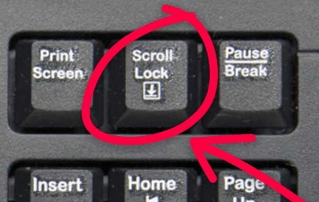
Yeah similar to that.
 ?
?
don’t change the floppy :( once nobody speaks of it, it truly dies
Don’t worry, your wife still will.
Not quite dead yet. This seismic survey ship I was 9n fairly recently… we had generated the navigational data, and needed to feed it into the ships autopilot. This was done via floppy.
Yes, it was a relatively old ship (late 90’s, I think), but there are plenty older ones around. And even when refurbishing a ship, they often leave the autopilot alone.
Yeah I probably should have qualified that with, “unless you’re a municipal/city/state transportation system or in maritime.”
Or pretty much anywhere in the manufacturing sector.
Plenty of products you use on a daily basis, especially processed foods, are being cranked out on equipment controlled by PLC’s from the 1980’s or earlier.
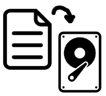
Or just the hard drive by itself. Is a platter drive old fashioned these days?
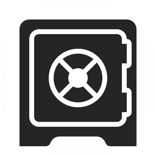
Also a safe would be a decent choice.
Why do you want to move a piece of paper onto an old style record player?
I mean I’m in my 40s now, but we still have spread sheets, Word documents, and web pages don’t we?
And I think everyone still knows hard drives are at least a thing? I can buy people in their early 30 or under never used a floppy, but we’ve all used some form of hard disk.
Also, I noticed no argument of the safe suggestion, and I hazard a guess many fewer of us have used an actual safe than a hard disk, especially a safe with a big swinging lock, but I think the majority could get the intent of putting something in a safe. Perhaps an open safe with an arrow going in if we want to be grandiose about it? 😉
A safe would make more sense for an encrypted partition or directory
It’s a floppy disk. Which is the universal icon for saving, the same way a red light is a universal symbol for “stop”.
You underestimate the power of arbitrary symbols. Welcome to all of human semiotics.
No I get that but I’m asking that given what we know about symbols and how we process information, what would be a better icon that can indicate save without having to be taught? There is clearly no right answer here but is it even possible to create something that would work? Things like rain or clouds we can do because there we can see examples. Is there anything that indicates saving we could come up with?
Probably not. We use a kebab or a hamburger to mean “tap here for a menu” for some reason
The symbol is meant to represent line items on a menu. It’s referred to as “hamburger” because it’s whimsical, Leland.
But we did. We used a 3 1/2 floppy disk, which only made sense referentially very briefly (after it took over from 5 1/4 floppies, but before all the saving was handled by a hard drive), and then that became the convention.
You’re asking if there’s a referential equivalent you could do now. You could do a little cloud or whatever else, but it wouldn’t be any less “taught”, because the teaching happens, like any other UI iconography, by having a bit of text next to it in a menu or a tooltip and then it becoming an arbitrary icon that just means that thing.
The point of the icon referencing something (star for bookmarks, a down arrow into a little box for download and a puzzle piece for extensions in my Firefox bar right now) is to make it easier to remember later because there is some context that connects the visual to the functionality. It’s not necessarily to make it so that I don’t have to learn what the functionality is in the first place and just intuit from the visual. That just happens because I have decades of knowledge about what the functionality in browser is supposed to be and what the arbitrary convention for certain functionality across other apps ends up being.
Your difficulty here is the qualifier “better”. We can create a different icon. A more modern icon. A cooler icon. But there is not a better icon, not until fewer people understand the floppy means save than those who have no idea what it is. And because it’s self-reinforcing (“the save icon is a floppy disk because floppy means save”), that’s not likely in my estimation.
You’re asking for an abstract indicator of a concept. You might as well be trying to draw ‘dignity’.
Everything else will become obsolete with time, and that’s not necessarily a bad thing. We have countless icons that have long since been separated from their original meanings. The need for it to be intuitive is when the concept is new, not as it changes.
Yeah you’re right, but I think it will be interesting to hear what people come up with. It’s similar to the nuclear waste warnings. Wikipedia Nuclear Waste Warnings

This is how ancient Egyptians prepared their dead
Uplifting my mood
I’m pressing it.
Interesting concept, attempting to indicate something entering the brain/head/statefulness. I wonder if we could generalize it further so that race of underground mole-people would understand it as well (e.g. not a species-specific head).
“I have updated the save icon from a floppy disk to a CD-ROM.”