

God I miss the original Material Design
The homogenization of these icons has been a long source of consternation for me.
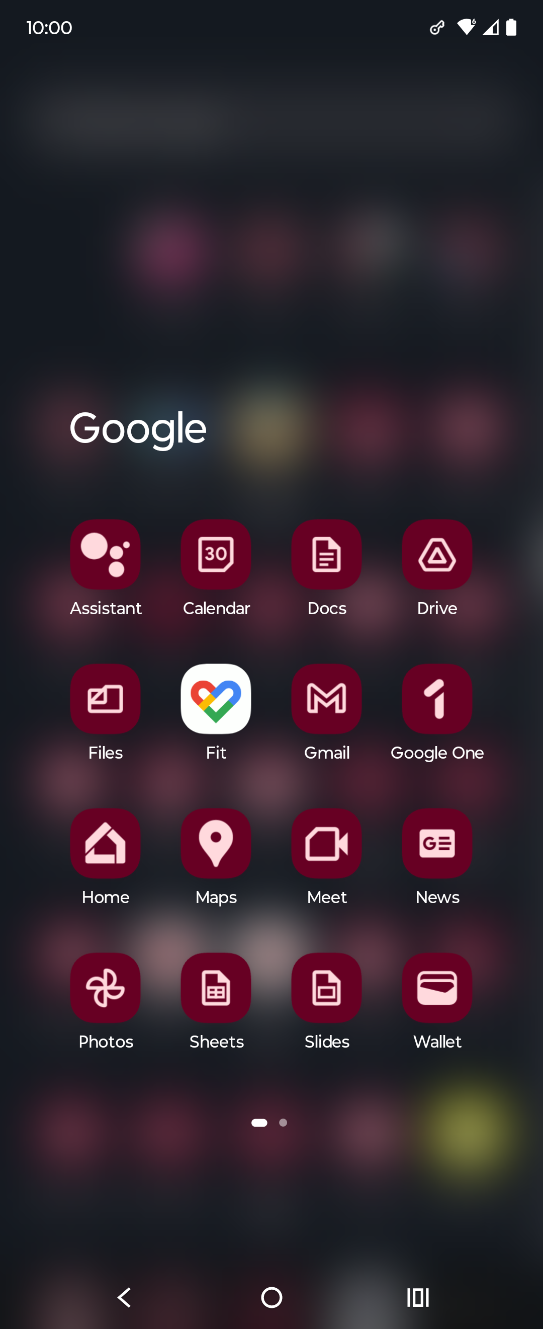
They’re barely functional as icons; you can scroll right by them and miss them; which makes finding the apps in a list of apps a bit annoying sometimes. Removing each icon’s unique color scheme and replacing it with the ‘company 4 colors’ was the stupidest fucking idea ever.
Even more infuriating is how they keep renaming the applications to unexpected things every so often; so they move around; and it’s dreadfully annoying to remember if they prefixed the name of the app with a G or something else completely different, which renders strict alphabetical sorting a bit moot.
Just had to comment on your elegance and class good sir. Carry on!
Pardon; but I do happen to be a lady; thank you.
Just had to comment on your elegance and class good
sirma’am. Carry on!Yikes with the down votes sheesh. Some redditors snuck through!
It can get even worse. My phone lets me do this to my icons which is ridiculous. I think this was opt-in but now that I’m going through my settings again I can’t actually figure out how to turn it off lol
Long press the homescreen, wallpaper and style, themed icons
This is Material You icons; and this is basically not something you can opt out of…that I know of. You may want to find a different Launcher that allows you to load icon packs or disable that Material You behavior. (If yours doesn’t)
I feel like it’s easier to use the monochrome mode of the phone than these icons
Its one of those things u never think about as a person without disabilities, cuz i can tell the difference just fine, i guess they should have consulted someone with a vision impairment when considering stuff like this.
It’s not even more aesthetic. Just more unified in branding.
Whatever. It sucks ass is the point.
My point is that it’s also ugly.
I think what really bothers me about the aesthetics is that the shapes are broken up by the coloration. For example, the pin icon for Google Maps looks almost like a hook, because the yellow has little contrast on this white background.
Yeah, the old logos were all over the place. At first glance it’s not obvious they’re all Google apps.
To me, that’s just the case for camera and calendar. Maps is IMHO perfect (except the unnecessary G) and the red-and-white envelope is quite well-known.
And? All of those being part of the same walled garden is a bug in the legal system not a feature.
Better be explicit about the walled garden rather than being diffuse about it
And the interface of their apps are still incoherent af. I don’t know how, but they manage to make things worse every time
It’s ok, they’ll just retire the service eventually.
And that’s why I don’t really hate it. I hate Google, but I think it’s a neat design choice. I still hate Microsoft’s icon design a lot though, they can’t seem to stick with one thing.
I definitely find it more aesthetically pleasing. Just like the icon packs.
To be honest the maps and the meets icons look better
Color is the first thing the eyes tend to notice, then shape, then lines and details. The new icons all look the same at the edge of my vision, I have to look at them straight on to distinguish them. Individually each one is fine but together, like what the hell?
I don’t rawdog Google icons anymore anyway, I use an icon pack
What I keep seeing: $ $ $ $ $
Since Gmail doesn’t have the obvoious envelope anymore I often open it when I want to open Maps. My brain ist like “M for Maps”.
I like the new version of the last two, but old for the rest
The camera app and spreadsheet app? Because that’s what i would’ve guessed they were based on the icons
those are Meet and Calendar.
People simultaneously justifying their jobs but not willing to make significant, meaningful changes
What do you mean, the new ones are still different shapes.
I think the maps actually looks more distinctive because of the shape. The rest are worse to differentiate though.
Anyone else this there’s actually nothing at all wrong with the “New” row of icons? Except for the triangle one, which is terrible in its “Original” version as well, as it indicates absolutely nothing about its app (I believe it’s Google Drive, right?). All the rest are clearly distinguishable, and have relevance to what the app does.
The Google drive logo is even worse when you compare it to the play store logo which is also a triangle. I mix them up all the time
I’m mad that the Gmail icon is no longer an envelope, but other than that they’re fine.
I’ll keep using my favorite icon pack instead, thank you very much
which do you use ? i am looking for a good one
I use Flat Circle. It’s not free, though.
Poppin, Olympia, Cyber, Minima and/or Outline, depending on the mood, season and launcher. There isn’t much left on factory spec with my phone.


