
Haha silly Manjaro users, only 6.83 happy while I am 6.93 happy as a Debian user. My Linux knowledge is clearly superior to most, not counting those excessively happy freaks running Slackware.
-
That’s a misleading Y-axis. The difference (in self-reported subjective happiness rating 1–10 too) is not as significant as the graphic implies visually.
-
Phew, I use Librewolf on Artix Linux. I’m safe 👍
The difference (in self-reported subjective happiness rating 1–10 too) is not as significant as the graphic implies visually
Ah here is another one. So what? It makes the difference more distinguishable, which also the graph denotes numerically. Otherwise all Linux distros users would appear too flat to make any difference interpretable.
The fact that there are at least two such comments around here shows why teaching anything in schools is doomed to fail.
Even critical thinking skills are applied in a canned, thought-terminating fashion, similar to how XX/XY chromosomes are considered the only reality, in overconfident falsehood.
What a bizarre reply. It implies that the difference is statistically significant when it’s in fact much less so.
Otherwise all Linux distros users would appear too flat to make any difference interpretable.
That is the point. The graph obscures this.
Ah the statistical significance, which as everybody knows is assessed …visually? Mic drop
BTW I have another comment here, totally irrelevant to this discussion, that I bring up statistical siGnifiCAnsE as an example of confident falsehood. Thanks for proving me right lol
Edit: here it is for context ( from https://lemmy.ml/post/17638298/12096466 )
Layman statistics is not the hill I would die on. Otherwise (being guilty of the fallacy myself) I now think that making a subject mandatory school lesson will only make people more confidently incorrect about it, so this is another hill I won’t die on for probability and statistics. See for instance the widespread erroneous layman use of “statistical significance” (like “your sample of partners is not statistical significant”) you see it is a lost cause. They misinterpret it because they were taught it. Also professionals have been taught it and mess it up more than regularly to the point we can’t trust studies or sth any more. So the solution you suggest is teach more of it? Sounds a bit like the war on drugs.
I’m not trying to do layman statistics. I’m stating that the graph obscures the magnitude of the difference between people’s ratings. You seem to be suggesting that I’m trying to do some kind of formal or specialist critique of the graph. I’m not. I didn’t go to school or anything and I am simply making a lay observation. If you disagree with it you can say without being so obfuscating yourself.
Although there is a common tip in critical thinking classes that manipulating the Y-axis range can lead to misleading presentation of a difference, I believe in this particular graph, which clearly provides numbers to compare, you can’t say it is misleading.
People can read and compare the values and draw their own conclusions. And I am saying that without any consideration of the distros discussed, since I am impartial to distros, I like all distros I have tried.
This “study” almost certainly must have way deeper assumptions- and metrics- related problems to start with, so even finding myself having this argument is preposterous. But I am just pointing out the misapplication of critical thinking guideline, and this is a valid point which I insist everyone who relies on to consider, if you care about critical thinking at all.
No one said you are doing layman statistics, the pasted comment is from another discussion, provided here for context, and for very good reasons. It aligns with obvious misconceptions about statistics that should be pointed out. Probability and statistics are thorny subjects that nonetheless are inevitable in order to understand the world surrounding us, material, social, and economic, so yes I will nitpick here and call out the misapplication of canned critical thinking thought-terminating cliches.
There’s not a lot of data to work with, and the kind of test used to determine significance is not the same across the board, but in this case you can do an analysis of variance. Start with a null hypothesis that the happiness level between distros are insignificant, and the alternative hypothesis is that they’re not. Here are the assumptions we have to make:
- An alpha value of 0.05. This is somewhat arbitrary, but 5% is the go-to threshold for statistical significance.
- A reasonable sample size of users tested for happiness, we’ll go with 100 for each distro.
- A standard deviation between users in distro groups. This is really hard to know without seeing more data, but as long as the sample size was large enough and in a normal distribution, we can reasonably assume s = 0.5 for this.
We can start with the total mean, this is pretty simple:
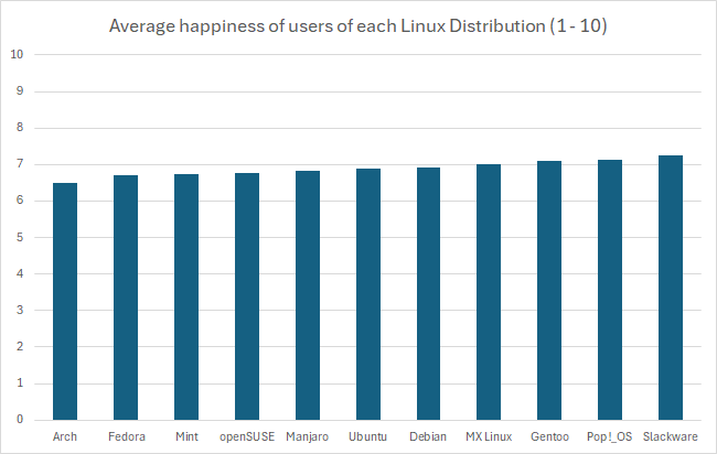
(6.51 + 6.71 + 6.74 + 6.76 + 6.83 + 6.9 + 6.93 + 7 + 7.11 + 7.12 + 7.26) / 11 = 6.897Now we need the total sum of squares, the squared differences between each individual value and the overall mean:
Arch:  (6.51 - 6.897)^2 = 0.150
Fedora:  (6.71 - 6.897)^2 = 0.035
Mint:  (6.74 - 6.897)^2 = 0.025
openSUSE:  (6.76 - 6.897)^2 = 0.019
Manjaro:  (6.83 - 6.897)^2 = 0.005
Ubuntu:  (6.9 - 6.897)^2 = 0.00001
Debian:  (6.93 - 6.897)^2 = 0.001
MX Linux:  (7 - 6.897)^2 = 0.011
Gentoo:  (7.11 - 6.897)^2 = 0.045
Pop!_OS:  (7.12 - 6.897)^2 = 0.050
Slackware:  (7.26 - 6.897)^2 = 0.132
This makes a total sum of squares of 0.471. With our sample size of 100, this makes for a sum of squares between groups of 47.1. The degrees of freedom for between groups is one less than the number of groups (
df1 = 10).The sum of squares within groups is where it gets tricky, but using our assumptions, it would be:
number of groups * (sample size - 1) * (standard deviation)^2Which calculates as:
11 * (100 - 1) * (0.5)^2 = 272.25The degrees of freedom for this would be the number of groups subtracted from the sum of sample sizes for every group (
df2 = 1089)Now we can calculate the mean squares, which is generally the quotient of the sum of squares and the degrees of freedom:
# MS (between)
47.1 / 10 = 4.71  // Doesn't end up making a difference, but just for clarity
# MS (within)
272.25 / 1089 = 0.25
Now the F-statistic value is determined as the quotient between these:
F = 4.71 / 0.25 = 18.84To not bog this down even further, we can use an F-distribution table with the following calculated values:
- df1 = 10
- df2 = 1089
- F = 18.84
- alpha = 0.05
According to the linked table, the F-critical value is between 1.9105 and 1.8307. The calculated F-statistic value is higher than the critical value, which is our indication to reject the null hypothesis and conclude that there is a statistical significance between these values.
However, again you can see above just how many assumptions we had to make, that the distribution of the data within each group was great in number and normally varied. There’s just not enough data to really be sure of any of what I just did above, so the only thing we have to rely on is the representation of the data we do have. Regardless of the intentions of whoever created this graph, the graph itself is in fact misrepresent the data by excluding the commonality between groups to affect our perception of scale. There’s a clip I made of a great example of this:
There’s a pile of reasons this graph is terrible, awful, no good. However, it’s that scale of the y-axis I want to focus on.

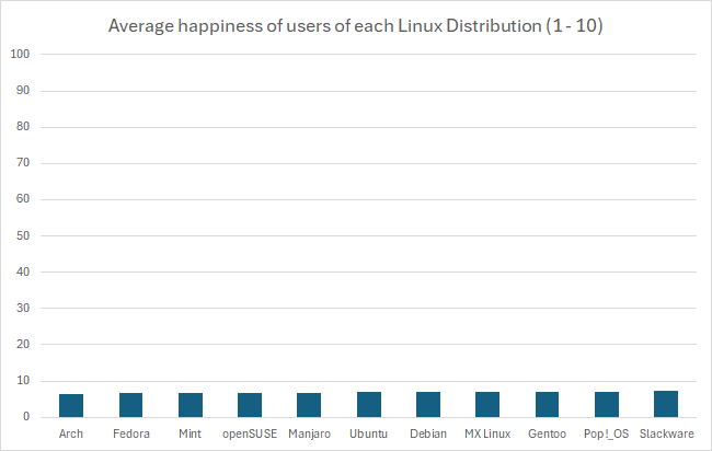
This is an egregious example of this kind of statistical manipulation for the point of demonstration. In another comment I ended up recreating this bar graph with a more proper scale, which has a lower bound of 0 as it should. It’s suggested that these are values out of 10, so that should be the upper bound as well. That results in something that looks like this:
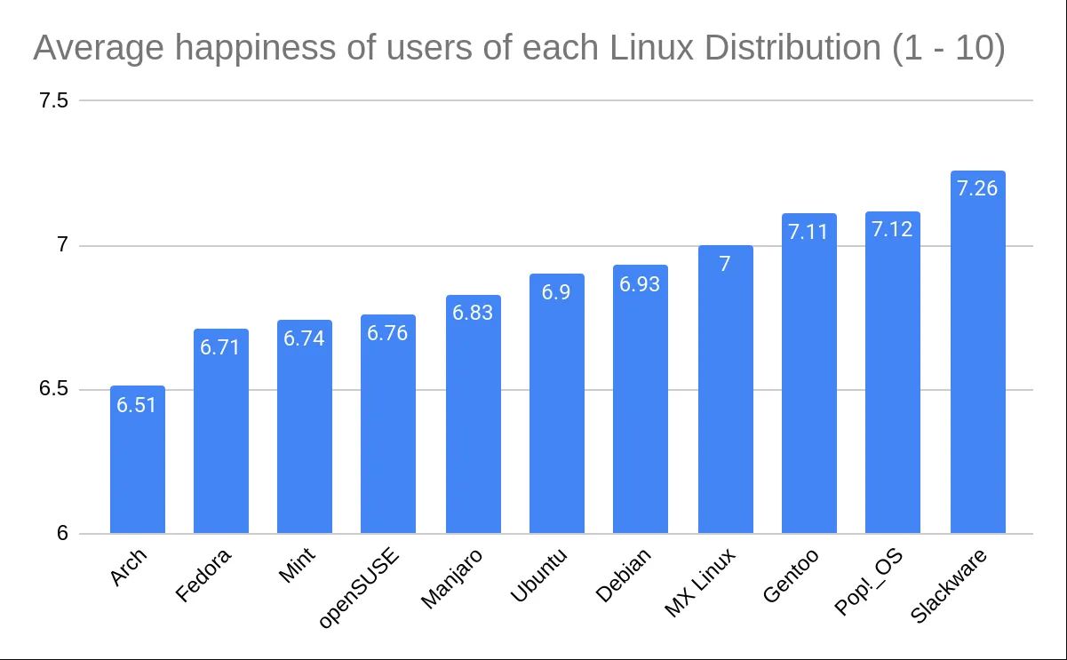
In fact, if you wanted you could go the other way and manipulate data in favor of making something look more insignificant by choosing a ridiculously high upper bound, like this:
But using the proper scale, it’s still quite difficult to tell. If these numbers were something like average reviews of products, it would be easy in that perspective to imagine these as insignificant, like people are mostly just rating 7/10 across the board. However, it’s the fact that these are Linux users that makes you imagine that the threshold for the differences are much lower, because there just aren’t that many Linux users, and opinions wildly vary between them. This also calls into question how that data was collected, which would require knowing how the question was asked, and how users were polled or tested to eliminate the possibility of confounding variables. At the end of the day I just really could not tell visually if it’s significant or not, but that graph is not a helpful way to represent it. In fact, I think Excel might be to blame for this kind of mistake happening more commonly, when I created the graph it defaulted the lower bound to 6. I hope this was helpful, it took me way too much time to write 😂
Oh sport, and I thought I was the one beating on a dead horse here. I understand why people claim to take issue with the Y-axis range. I am just saying chart makers can zoom in to make a point, and it is not automatically misleading. That is all. Anyway, thanks for writing this. Looks like a lot of effort, and some of it will make sense in my stats coursework, thanks!
I am not trying to apply a “critical thinking guideline” I saw elsewhere. I’ve not taken any “critical thinking classes”. I’m more insulted that you think I couldn’t have possibly just thought of that comment myself. It’s not a particularly crazy comment to make, and I don’t see why any individual who knows how to read graphs couldn’t just happen to make that comment.
Anyway—sure, I never said the graph lied. Perhaps a better wording would be that, regardless of how the information is presented, I don’t think the difference in magnitude between people’s happiness ratings (ignoring the issues with how those ratings were collected and ascertained in the first place) is significant or particularly of note. The Y-axis is chosen so as to visually amplify this difference. I didn’t claim the data presented by the graph was untrue or that reading the graph correctly was too difficult if one wanted to read it properly.
I really did not mean to be insulting. I am just saying chart makers can choose to make a zoom in, and it is not automatically propaganda or something. All this has led people astray of the real issues, like WTF is measuring ‘happiness’ on a 1-10 scale, and what are the metric properties of this 1-10 scale. Then there are all the sampling issues and what have you. I just expected more people discussing this stuff rather than the Y-axis.
+1
-
Good to see our Slackware masters are happy!
Slackware chads probably still think it’s 1990 and the worlds going great.
I use arch, I’m very happy with my distro. No bullshit, no decisions made on my behalf, no hacking around artificial limitations(fedora, Ubuntu), and no removing software to declutter my application menu.
I don’t know if it’s anyone else’s experience but troubleshooting arch is easier than other distros because your intimate knowledge of the system you built yourself. It has helped me with fixing other distros though.
A tip to new arch users, keep the AUR package numbers very low or at least mostly limited to packages officially endorsed or potentially maintained by the main project.
deleted by creator
I don’t think it’s the distro. Arch users are just always angry about everything whether it works or not.
No need to be rude. For all we know it’s all the writers opinion and isn’t based on any real metrics. Besides I haven’t seen anyone in the wild that actively uses slackware.
Perhaps I should have added that I use arch myself. All meant in good humor, and I’m sorry if I offended!
Let’s go Pop!_OS! We’re #2! We’re #2!
Coming for #1 baby
That will happen after the stable release of cosmic de
Was that sadometer correctly calibrated to NIST specifications?
Correlation vs. causality!?
Exactly what I was thinking. “People who are already less happy tend to gravitate towards Firefox” is as valid a takeaway from those graphs as anything else. (Also, where are all the other browsers? I’d expect Edge and Safari, at least, to be represented, even if Vivaldi and various Firefox forks were not.)
Bro, I rage at Ubuntu. Literally. Kinda unhappy when at work and using my Kubuntu.
(But unhappiest with Windows)
At home, 4 Devices use Arch Linux and I am the happiest person on earth with them. I love knowing how I set them up and how to fix something when broken.
I reinstalled Windoes 4 times because it somehow broke, while I still kept my Arch Linux through over 4 years.
(Generally, I dont tinker much with Arch Linux and generally was a Person who spent a lot of time with a Girlfriend. I read that wife, kids and etc was a point. Thus, I am mentioning how satisfied I am not only with my OS but life too. I also love my work, I just ignore that Ubuntu breaks sometimes. But generally, I wished I would be hsing Arch on my work)
İgnorance is bliss
Oh look, another Lunduke article. I’m sure there’s no bias at all. Nope.
In any case, I adore Arch and Firefox and am extremely happy with my Garuda install.
Whoa. So I grew up on Slackware but switched to Debian some time ago, and I can say I’m MUCH happier on Debian. The dependency hell on Slackware just killed it for me. I know they have some management of it now, but I just couldn’t take it any more - I was spending way more time administering the machine. I held my breath updating, which made me reluctant to update, which isn’t a good thing from a security point of view…
Yeah. My journey was similar. I appreciate the philosophy behind Slackware, but I don’t feel like I have the kind of spare time I feel like I would need to run my systems that way.
I think, for me, the proverbial straw was the Unifi controller. I was just like, “No. I can’t do this. I don’t want to do this.” My desktop was running Kubuntu at the time, so installing it on there temporarily was a breeze (confirming I was making the right choice), until I got the server switched to Debian.
These results seem freaking bizarre and I’m highly skeptical. You’re telling me that Slackware users, freaking SLACKWARE, are the happiest? And Firefox is the least happy? I am so much happier using Firefox than have been with Chrome for at least a decade.
As a former slackware aficionado, I’d have to say that the general mood of the users and development team was super chill. Hell, the name slackware comes from “slack”, the goal of the Church of the SubGenius. The whole thing is a meme that’s been going steady for decades.
I had the privilege of meeting Patrick and much of the core Slackware group at the KDE 4.0 release party. They are all awesome.
I can expect that users that tolerate the Slackware style are also those that are pretty laid back to begin with. Probably they were happier people already, and using slackware just vibes with them.
The question wasn’t how happy users are with their distro, but in general. My theory is, people who have a lot of great things going on in their life (wife, kids, social life) don’t bother installing Arch.
I wonder if people using steam decks know they are running Arch.
Wow, no need to make this personal. /s
And people who have no time install gentoo? Pull the other one :D
Gentoo installation is time-consuming, but Gentoo maintenance usually isn’t. Just allocate portage a couple of cores while you do something else with the rest of the computer. Or leave the update to run overnight, if you’re on a potato.
You’d be surprised.
I feel like this post would have been downvoted a lot less if I had altered the title to “Slackware users are the happiest!😊”
So of the three happiest distros, two aren’t very concerned with mainstream appeal and will carry on contentedly doing their thing while ignoring rankings like this. Sounds about right.


