I am not trying to apply a “critical thinking guideline” I saw elsewhere. I’ve not taken any “critical thinking classes”. I’m more insulted that you think I couldn’t have possibly just thought of that comment myself. It’s not a particularly crazy comment to make, and I don’t see why any individual who knows how to read graphs couldn’t just happen to make that comment.
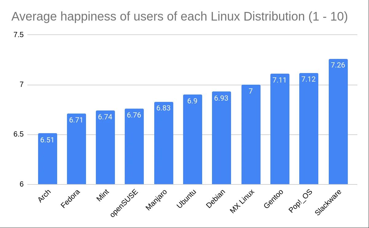
Anyway—sure, I never said the graph lied. Perhaps a better wording would be that, regardless of how the information is presented, I don’t think the difference in magnitude between people’s happiness ratings (ignoring the issues with how those ratings were collected and ascertained in the first place) is significant or particularly of note. The Y-axis is chosen so as to visually amplify this difference. I didn’t claim the data presented by the graph was untrue or that reading the graph correctly was too difficult if one wanted to read it properly.
I really did not mean to be insulting. I am just saying chart makers can choose to make a zoom in, and it is not automatically propaganda or something. All this has led people astray of the real issues, like WTF is measuring ‘happiness’ on a 1-10 scale, and what are the metric properties of this 1-10 scale. Then there are all the sampling issues and what have you. I just expected more people discussing this stuff rather than the Y-axis.
I didn’t say it was propaganda—the content of the graph reads as quite clearly silly to me and not trying to make a particularly serious or scientific point. I guess the same reason is why I pointed out the Y-axis instead of the sampling issues, because the sampling issues seem much more self-evident.

I am not trying to apply a “critical thinking guideline” I saw elsewhere. I’ve not taken any “critical thinking classes”. I’m more insulted that you think I couldn’t have possibly just thought of that comment myself. It’s not a particularly crazy comment to make, and I don’t see why any individual who knows how to read graphs couldn’t just happen to make that comment.
Anyway—sure, I never said the graph lied. Perhaps a better wording would be that, regardless of how the information is presented, I don’t think the difference in magnitude between people’s happiness ratings (ignoring the issues with how those ratings were collected and ascertained in the first place) is significant or particularly of note. The Y-axis is chosen so as to visually amplify this difference. I didn’t claim the data presented by the graph was untrue or that reading the graph correctly was too difficult if one wanted to read it properly.
I really did not mean to be insulting. I am just saying chart makers can choose to make a zoom in, and it is not automatically propaganda or something. All this has led people astray of the real issues, like WTF is measuring ‘happiness’ on a 1-10 scale, and what are the metric properties of this 1-10 scale. Then there are all the sampling issues and what have you. I just expected more people discussing this stuff rather than the Y-axis.
I didn’t say it was propaganda—the content of the graph reads as quite clearly silly to me and not trying to make a particularly serious or scientific point. I guess the same reason is why I pointed out the Y-axis instead of the sampling issues, because the sampling issues seem much more self-evident.