

- cross-posted to:
- [email protected]
- cross-posted to:
- [email protected]
cross-posted from: https://midwest.social/post/21866907
You must log in or register to comment.
I prefer it to most ui these days, tbh. Everything is either hypergeometric and boring, or forces mobile website design into desktop use for no good reason.
Flat design overdone like today is horrid
It certainly has character!
Steam does just that though, it’s design is shit for desktop.
Short of one window with multiple columns functioning as one long list of your games I fail to see how you want steam to act even more like a desktop application UI wise.
It really doesn’t
There is certainly worse but it isn’t stellar either
That’s the joke
Give me the classic green/gray with white or orange/yellow text plz
Whatever you do don’t look up the video where a ux person fixes steam it will make you more annoyed.
If you’re talking about the one by Juxtaposed, I really like that redesign, it’s very usable.
Yeah that’s the one drives me nuts it’s not like that on steam
Do you have a link? I will live with my regrets. Lol
Lol, must be a headache for the devs maintaining it, but from the end user perspective it is way more pleasant of an experience than epic, origin, gog, ubi and whatever else is out there.
While the app is definitely ugly, I spend less time on Steam than in the games I am launching with it. But I do not use any of the community features. If an online search brings me to a steam community, that’s how I end up there, for no other reason really.
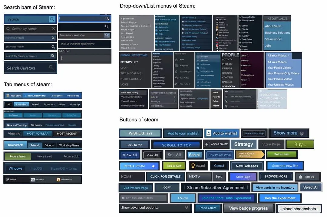
Steam has a decade of different design choices stacked on top of each other. It’s weird AF that they just don’t update some of their old styles, but what’re gonna do?
I have never noticed this. Shows how the average consumer doesn’t really care about consistent design languages.
Given Valve’s history of taking play testing really seriously, I wonder if this is something they’ve realized through user testing?
Maybe there’s some advantage even because for the ones I’ve used a lot i know at a glance which part of steam they’re in, which wouldn’t be as easy if the only difference was the text. And each part of steam is usually internally consistent, at least mostly.
i really hate the custom window controls in the steam client
Reminds me of Windows UI — usable, but inconsistent. Obviously a lot of glommed on tech debt that was never updated.
Why did that get downvotes? This meme here is a remake of the meme about Windows’ UIs.
this might be THe only thing i like about steam
And you still have to have it running, including their pseudo webbrowser, to log into your Steam account in a third-party tool.
They should just provide an API with conditions for their DRM.
And workshop should have a “Download” button, steamcmd sucks for that.
And i hope it never changes. It works. Don’t touch it!
Really insane that companies will pay for memes like this to be posted but refuse to develop viable competition
Are you genuinely insinuating that something like Epic Game Store paid for this as guerilla marketing?
There’s a current effort being made by games companies who see themselves as a competitor to valve to sow criticisms of Valve in online spaces.
A ton of it is inorganic.
There’s also some stupid UX choices that show they simply don’t give a fuck. On the Steam Deck when you want to update something and you don’t have enough space it simply says “not enough free space”. What use is that to me? Tell me how much you need!
Tell me how much you need!
More.


