
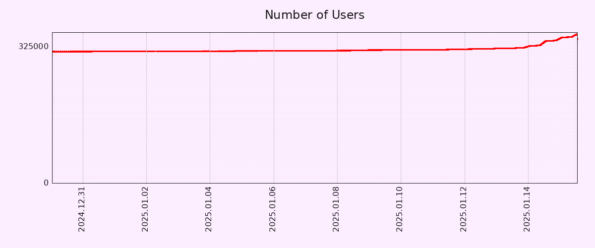
Editing to let people know that I will be blocking anyone who feels the need to tell me why this graph is inaccurate. I truly don’t care, but feel free to chime in with your useless take and land a spot on my block list! 🙂
You must log in or register to comment.

Graph
Your graph sucks
Hey man, I don’t care about your graph but can you just block me anyway? Cheers! 🙂
I’m not sure the graph is accurate.
what the fuck is a pixelfed
It’s an Instagram replacement.
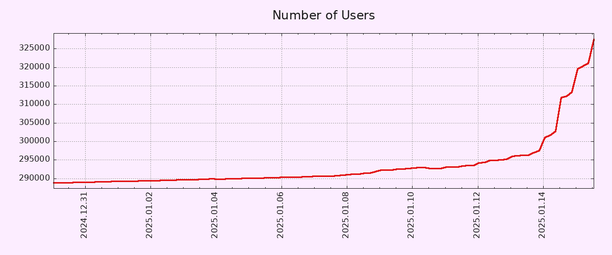
You have zoomed in. I want to see the y axel from 0. It have increased with 10% of the users.
For other nerds that absolutely hate dishonest and biased graphs, I present the normalized data. Wow. What a vertical line. 🤦♀️
its the federation effect in action. I expect pixel fed to get a slow trickle of new users as legacy social media cages and milks its current users for ads.
Despite the misleading graph from OP, the slow uptick seems to be common with federated social media because there’s little incentive to make viral posts to sell ads.
Exactly my first thought seeing this graph.
looks like … the climate has changed
Let’s hope the mobile apps become real mobile apps instead of web page wrappers.
I can understand if you build a site that allows itself to be pinned to your device as if it were an app. That’s a great way to get a product onto devices before you have time+effort to build a native app.
It’s quite another thing to have an actual app with a highly visible GUI wrapper whose only purpose is to connect to and display a specific website.
Like, c’mon.
I honestly prefer other sites/apps anyway. Tusky is a great app for connecting all your fediverse accounts in one place, and friendica has a filter by image option that essentially turns it into Pixelfed.
Pixelfed is federated, an account can be made with Mastodon to log into different servers. But it seems different from lemmy in that joining one instance doesn’t seem to provide you with a method to view other instances and pick and choose as part of your feed. I think some people find that confusing. Any comments on that?
Yes, it’s the most confusing part, if you want to discover Pixelfed accounts from other servers, you have to go to another server’s home page, then click on “Explore” which will show you popular posts by that server’s users. I have done this and now I follow a bunch of accounts from other servers, but the process is very convoluted and the average user would not bother I guess.
The web version of Pixelfed does have a “Global Feed” page but that’s 99% Mastodon posts because the “Global Feed” is actually global relative to the whole Fediverse.
Yes, I think for new users that is very confusing. I find that somewhat confusing and I think I have an idea what’s going on.
Yeah, fediverse platforms aren’t going to seriously compete against the big corporate ones until the user experience is as simple.
Exactly. I agree. It needs to be simplified. As easy as creating an account.
Lemmy is unique on the fediverse, in that it has communities that you can subscribe to. The closest equivalent is community groups on Friendica. Pixelfed is more similar to Mastodon in that you can follow individual accounts, or hashtags/search terms, which is how you subscribe to different content in your feed. For example, I follow #catsofmastodon and see all posts tagged with that in my feed. Hashtagging your posts is very important if you want it to be seen. Lemmy is more oriented towards discussions, which is why communities make more sense in this context than on Pixelfed or Mastodon.
I saw Pixelfed mentioned on TikTok. So yeah!
https://vernissage.photos/home may be better than Pixelfed. https://discuss.tchncs.de/post/28641458
I’ll make an account when it reaches 1M users
So…monday?
This is what a good app does to a MF.


