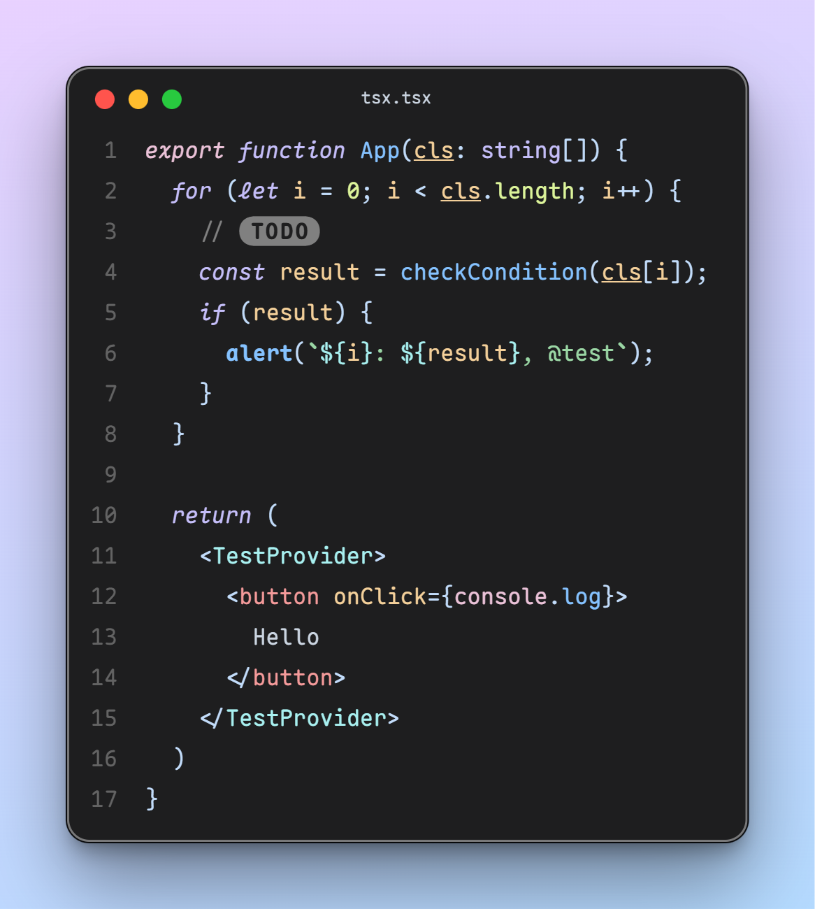
What fonts are you currently using on your system? Which do you think is best for the terminal or for your desktop environment?
(updates) Ok I think I’m a fan of Ubuntu nerd fonts right now
U001 is my main system font as a clone of Univers. Monospace is Berkeley Mono—it might be paid/proprietary but boy does it look nice & was an upgrade from several years with Iosevka. JuliaMono is its fallback though since I use Unicode with frequency & Berkeley doesn’t cover all the symbols I use.
The important part is if you care anything about your fonts, you won’t destroy them by patching in that uncurated hodgepodge called “Nerd Fonts” clobbering used symbols or the wrought-with-false-positive “coding ligatures” which is not how ligatures are supposed to be used but programmers refuse to demand Unicode support in their languages to fix the problem.
U001 is new to me, so here’s a link for others to look it up.
The license is Aladdin which is kinda predates GPL but allows free usage if you aren’t shipping the font with your own competing paid software.
I’ve been enjoying Fira Sans and Fira Mono for far too long: https://mozilla.github.io/Fira/
I love Eurostile Regular. Git it at https://freefonts.co/fonts/eurostile-regular
Gohu Font Nerd is a nice small bitmap font I’m fond of. Only issue is the size for high DPI monitors, but the JetBrainsMono nerd font is a nice vector font that’s easy on the eyes (quite stereotypical/cliché, but that’s for a reason).
Interesting. What makes you use bitmaps as a system font?
Gohu:

I get it for TTYs. Though for TTYs nothing will take me away from Terminus :]
What makes you use bitmaps as a system font?
I like the aesthetic of bitmaps. Personal preference
Dropping a link for others since it’s the first time I heard of it.
any with a dotted zero, extra points for italic.
Lexend Deca for me. A mix of a dyslexoc-font, Arial and a bit of the roundness of Comic Sans. (Sorry, probably bad examples, am no font nerd)
I read through the website, and it feels… odd.
Is this font’s only purpose to be variable-width tunable?
The website has this interesting showcase:
“[Student fluency] is measured in Words Correct Per Minute… Each student read out loud a passage set in a control of Times New Roman, then four of the Lexend Series — Deca, Exa, Giga, and Mega.”
They even give example text for the viewer in both fonts. Of course, Times New Roman was blown out of the water, and the viewer can feel it.
But… this is apples to oranges. Of course the viewer can feel it, Times New Roman is a freakin’ serif, and there are a quinquagintillion sans serifs for small digital text, for good reason! Then what does this font have over other sans fonts? I couldn’t find the “Stanford study” or any other comparisons, but if I were to surmise a guess:
“Variable font technology allows for continuous selection of the Lexend Series to find the specific setting for an individual student.”
It’s to be able to adapt for a student reader’s preferences.
I dunno, the site’s framing of “changing the way the world reads” feels disingenuous – it’s a nice sans tho.
Ok, I never dug so deep, I just really like the design, I did not know (or forgot) their ambicious/overblown claims
I like Delugia for any monospace needs. It’s a nerdfont, and it’s nicely readable without looking too chunky.
Ah, looks like it’s a pre-nerdified cascadia! Not my personal style, but I know a few that love cascadia.
Ubuntu font. Idk why but I like it.
I agree! Nice memories of hitting backspace in a Linux Mint terminal and hearing that weird-ass BWOUP sound.
I recommend Ubuntu Mono for Termux users. Look at this black-background beauty – way better than the angly flat default

Whatever comes default with the current system.
Since basically forever I use DejaVu Sans for UI elements and DejaVu Mono for the terminal.
I always use Dejavu sans mono for terminal and programming too. I think its the best in terms of readability where indentation is important
me too, I loved Verdana before I discovered FOSS and DejaVu Sans is basically FOSS Verdana
I like Maple Mono https://github.com/subframe7536/maple-font
An independent open source font, interesting. Looks pretty too, especially for multiple colors
🟨 preview: Maple Mono

@SolarPunker I use Exo2 as desktop font and FantasqueSansMono in terminal.
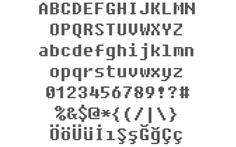
Fixedsys
Ohh, that’s what that 8bit-y font is called.
…wait. Why would you use 8bit as a system font???
🟨 preview: Fixedsys

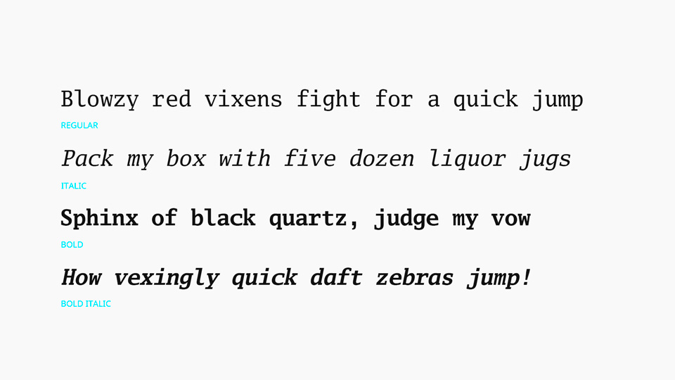
i want serifs. I use Go Mono for monospaced text. i’ve yet to find a good proportional slab serif font to match though.
By proportional slab serif do you mean unmonospacing the monospace like what Ubuntu does? I guess that’s why Go Proportional wouldn’t work being a sans serif
🟨 Preview: Go Mono

yeah just using the same characters but “squished” doesn’t work since the serifs take up the character space. you need a font designed as proportional. slab serif just means that the serifs are squared rather than pointed like on Times.
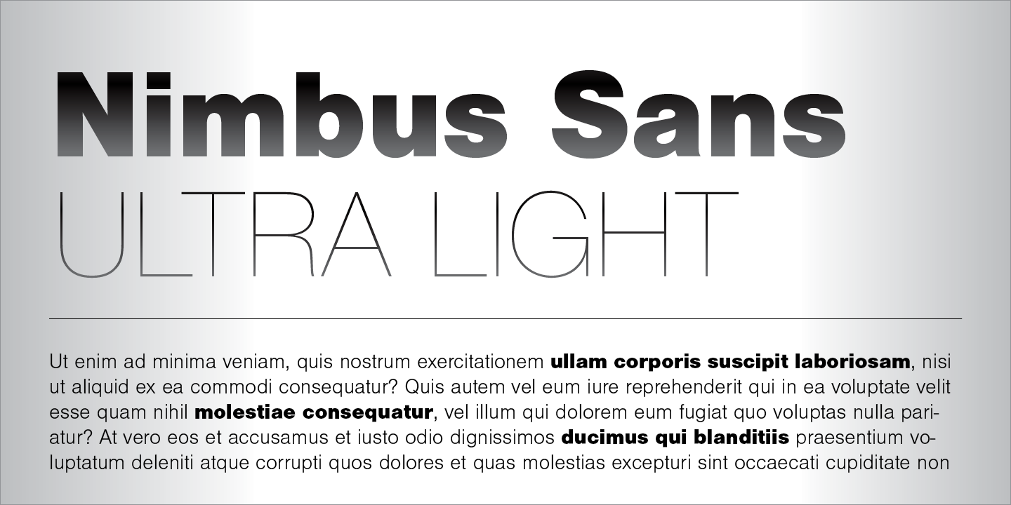
Anyone using Nimbus Sans?

It’s actually preinstalled in a lot of systems. You can check via
gnome-font-viewerorfind /usr/share/fonts -name "*Nimbus*"


