
serious answer: Discworld. every storyline starts out completely separate but through the years they wove together into a world rushing headlong into a new age.
shitpost answer: ace attorney. eat your hamburgers, Apollo.


serious answer: Discworld. every storyline starts out completely separate but through the years they wove together into a world rushing headlong into a new age.
shitpost answer: ace attorney. eat your hamburgers, Apollo.
60g/l. that’s all you need to remember with coffee.
Bing Crosby
asking questions like this is how i found out that one of the allowed characters in names in my country is ÿ, which is fine in Latin-1 but in 7-bit ASCII is DEL.
a charge cable is like 500 bucks. it’s definitely worth more whole.
that’s a first-gen chevy volt from 2012-2013. it can’t fast-charge at all, it’s limited to line voltage only. a full charge takes five hours, give or take. thankfully it’s a hybrid.
because the chevy volt uses a J1772 charge plug which, unlike the Type 2 used in Europe, doesn’t have a lock in it.
this is a very annoying fact about the chevy volt.


I use a french press and endeavouros. don’t know what that says…
you have to drink it at the gate to show that it’s safe


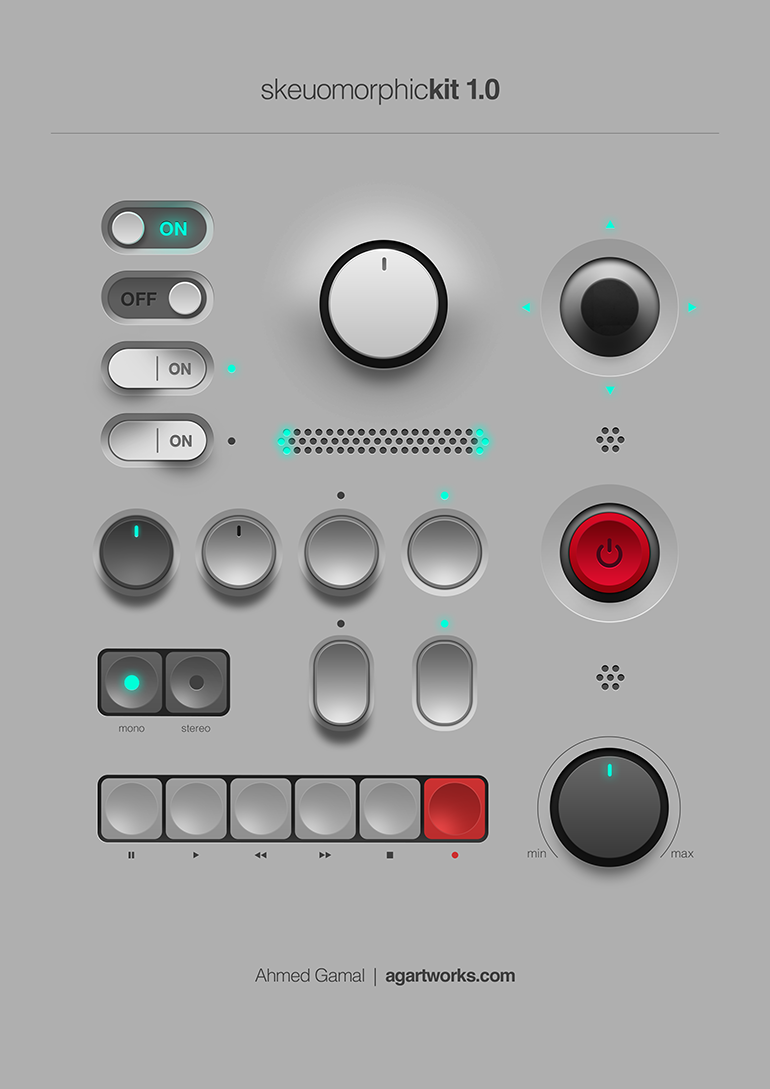
it’s weird that. it’s obviously possible to have a flat-shaded skeuomorph, just look at basically all of windows 95, but for some reason we connect them to this particular graphical style. files and folders are both part of the old classic “desktop metaphor”, so they basically have to be skeuomorphs. but like, the application icons are basically just mosaic tiles of the normal icons.
a proper skeuomorph would indicate what the program is for. krita and whatever map software that is are both good, if a little flat. but the libreoffice suite just being squares with a letter on them? have them be like, a spreadsheet for calc, a stack of cards for impress, and a printed page for write.
remember all the icons for windows 95 network utilities that have people in them? those are also (attempts at) skeumorphs because they’re trying to communicate what the program does.


a skeuomorph (from greek, “tool/container-shape”) is something that retains the characteristics of another thing that it is based on, even though those characteristics are no longer useful. think lamps shaped like candles, or the floppy disk save icon, or media player programs with volume knobs.
skeuomorphic UX is a good way to get users comfortable with a system by using designs they are already familiar with, and the original iphone used this to great effect.
This is a good example of skeuomorphic UI:

all to say, I’m not entirely sure these icons are skeuomorphs. they’re just glossy.
i used to do IT for a company that isolates and sells antibodies. the amount of money you can charge for what is basically a single drop of liquid is truly staggering.
also, they had freezers that went down to -90C for long-term storage, which was really cool.
that format would mangle so many names. my legal name is my middle name, so it would fail. my grandfather’s first name was Jan Erik (with a space, it’s still a single name), it would fail on that. i know a guy named Göran, it would fail on that (ö is not an accented o, it is a separate letter, but it will slugify to o due to browsers being browsers).
actually, come to think of it, wouldn’t this also mangle the default due to ‘friend’ not being properly capitalized?
basically, we’ve learned nothing since ‘falsehoods programmers believe about names’. that was 14 years ago.
it looks sort of like a continuation of the beaker browser project. basically, a peer to peer browser that also serves content you have made to others using the browser. it’s a cute idea.
it’s the result of a paper on the social hierarchies of captive wolves, which was retracted when it turned out that they work completely differently in the wild. bragging about being an alpha is basically asserting that you would be a top in prison.


The Incredible Machine! the original Rube Goldberg game. me and my friends played the shit out of it in the 90s. a few years ago i decided to give it a google and i found out that not only were there an expansion i hadn’t heard of, there were five other games in the series.


i don’t know about “cross” :P it’s a bit-for-bit reimplementation of Elite 2. i loved that game as a kid and pioneer is a great version of it.
it does have a setting for triggering the alarm if you pull the cable out without unlocking the doors. which just feels like such a non-solution.