

This is the weirdest star map I’ve ever seen.

1+ for Anya!
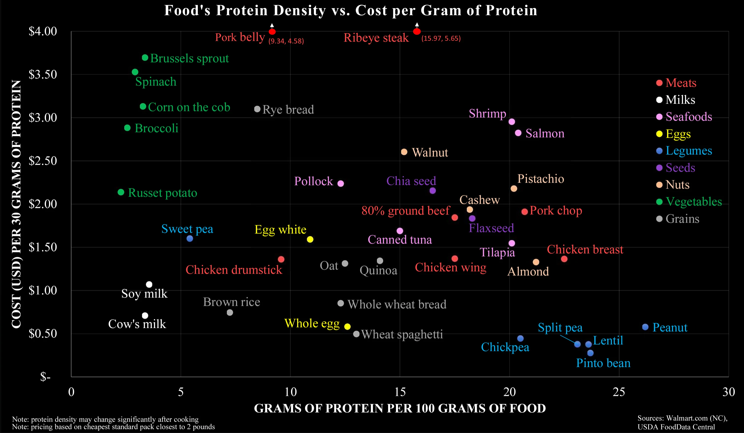
I have found myself going back to legumes for my diet due to the cost efficiency.
Monetary cost is the wrong y-axis here, as it optimkzes only for mega-scale farming without taking its real costs in consideration. It should be ‘true cost’, which also accounts for environmental-, animal- and climate mitigation cost.
I think this is what it’s meant to be about. “How do I afford a good amount of protein with not much money?”, is the question it’s answering.
It reminds me of a Reddit post I read several years ago where someone shared their advice on how they managed to live under extreme poverty. They spent a good amount of time talking about what foods are the most cost effective to buy and this chart lines up with what they have been saying pretty well.
That goes from a nice little graphic to a socioeconomic PhD.
And subsidies
Indeed. I pay taxes that will become subsidies for a lot of those things in the charts, especially those I don’t even consume.
Selfish people don’t care about those factors. The existing graph has a better chance of swaying them.
That’s nice for scientists and policy makers. Not so useful for people buying things at the store.
So much wrong about this chart. It is factually correct, but it answers the wrong question.
This chart makes it way too easy to optimise for cheap protein, which is misleading. It is not this what it takes to have a healthy organism. It takes a varied diet, with balanced quantities of liquids (see milk), vitamins (see sprouts), fatty acids (see salmon), minerals (see shrimps, eggs, walnuts), actually carbs (potatoes, rice, spaghetti), and much more…
Most crucially, the graph is an oversimplification of protein content. Legumes do not contain the full amino acid chain unlike meat. Non-meats need to be evaluated with the nuance of its nutrients not necessarily being as bio-available for human digestion. Carrots and Vitamin A, for example.
I’ve had to debunk this myth multiple times in this post already, I’m not sure who started it. Legumes do have all the aminos and in sufficient amounts.
Also on bioavailability, it is a double edged sword. For example heme uptake is greater than mineral iron, but your body has very little control with inhibiting uptake when you already have adequate levels. With the mineral form your body has various ways to promote or inhibit uptake. The same is true of your example of vitamin A. You can pretty much eat as many carrots as you want and suffer no ill effects, eating too much liver or taking too many liver oil supplements however can lead to poisoning.
Thank you for saying this. The PDCAAS shows the digestible properties of different protein sources. It would be a good multiplicative factor for the X-Axis to make the sources comparable, since Cow’s Milk, Chicken, Egg, Whey, Casein, Tuna and Soy Protein (Isolate) have a score of 1 while Lentils, Tofu, Rice and Wheat have roughly 0,5.
That means you need to eat (and buy and cook) twice the amount of the latter to gain roughly the amount of actionable protein of the former.
I think it’s specifically meant to debunk the idea that meat is the only affordable source of protein-dense food, when in reality there are vegan protein-dense foods that are even more affordable.
That doesn’t conflict with the fact that a well balanced diet is important; it’s just addressing one sticking point that tends to come up in these conversations.
The legumes are pretty much bs though (except peanuts) as those are dry weight, cooked weight drops Pinto beans to 9 grams of protein. Protein density drops because bean weight increases through absorption.
What’s wrong with reducing density through absorption (of water)?
Nothing at all. But it reduces protein density, so makes 25 grams of protein per 100 grams weight meaningless. No one is eating uncooked, dried pinto beans.
And meat would go the other way. Less fat and liquid after cooking. Doesn’t change the overall amount of protein but does change how much you can consume at once.
To me it seems that your interpretation completely disregards the Y-axis. On the other hand, I wouldn’t think the colour coding does a good job in separating along the carnivorous-vegetarian-vegan scale.
Lmao you don’t need any animals or their secretions in your diet to be healthy.
Your seem to insist to twist this towards vegan wars, but this is you. It’s not the graphics, it’s not me.
There is no conflict here and no war. You made the false claim that for a balanced diet, animal parts are required. I corrected you, that’s it.
Y’all are all fucking up. This is a raw survival chart. This is not a save the planet chart. This is a capitalism has fucked me, how can I best spend my negative money to eat chart, and it is spot on. Eggs all day if you can afford it, and those dirt nasty bad boy legumes if we’re willing and able to cook a good meal. Well done.
Lol right? only people who don’t know how to cook think beans and lentils tastes bad.
Lentils: boil in water or broth with paprika, pepper, bay leaf, and add salt half way through. 15in for red lentils, 20-25 for green.
Beans are extremely versatile and can go in almost anything, for sure chickpeas can be cheap as hell protein for all sorts of dishes around the world if you don’t want to spring the rising costs for meat. They are dirt cheap canned and can be even cheaper dry and just need to be soaked then cooked.
Yeah, I interpreted it as such, which made me even more confused there’s only milk and no other dairy products. Here in Germany at least, if protein for cheap is what you want, you go with Quark or Harzer.
EDIT: Huh, I just did some very rough math in my head, going with 1,35€ for a 500g pack of Quark from Lidl, and interestingly, that seems to put it roughly at the same place as actual milk, with it having 60g of protein, that is fascinating.
Peanut
Beans ftw
Lentils and chickpeas have more per-gram protein than chicken and mutton!?
Why do I see thousands of health/bodybuilding influencers saying exactly the opposite and pushing meat consumption instead of legumes on a daily basis then?
Protein quality. Whey (isolated milk protein) is “goat” for a reason. It contains all essential amino acids you want + good ratio of leucine.
For something like chicken, the macros are also noteworthy. 100g of chicken is 23g protein, 2.1g fat and 0 carbs.
Lentils have 3x more carbs than protein, peanuts have 25g protein, 32g carbs and 39g fat. So it isn’t food that lends itself to a high (ratio) protein diet unless supplemented with something that got better macros (like meat).
There are 9 different essential amino acids, and foods that contain all of them are considered “complete” proteins; like poultry, fish, eggs, dairy, and quinoa. If chickpeas are your only source of protein, you won’t be getting all of your essential amino acids.
Where’s broccoli?
Probably at the dot marked “Broccoli”
Oh woops, I’m on mobile and didn’t see it
I figured it was something like that. :)
Hm… this doesn’t exactly make sense - pork is normally cheaper than steak. Or maybe where I live, this is the case?
Also salmon is close to ribeye (protein content) but has far less fat than ribeye. Surprised sirloin steak isn’t in there which is normally more expensive than ribeye.
The Y axis is throwing me off a bit. If the X axis already shows the amount of protein per mass, why would you also couple the Y axis to the amount of protein? So all the products low on the X axis automatically increase along the Y axis. For example, the vegetables are probably that costly in this graph because they have a low protein content, not because they are necessarily that expensive.
I assume this chart is intended for people making an effort to eat as much protein as possible for as cheap as possible, I.e. bodybuilders, powerlifters, and the like. In that case you would want to avoid vegetables because of their low protein regardless of how much they actually cost, so the cost per gram of protein is actually more useful.
In fairness I may be reading too much into it; nothing about the chart actually specifies who it’s for.
I am a little thrown off by there being no cheeses and other dairy products at all. How does stuff like Skyr, Yoghurt, Quark, etc. compare?
My quinoa, beans, and almond milk diet scores well. My popcorn snacks don’t, but I’m not focusing on macros there, but rather volume/kcal.
Egg superiority.
It’s pinto beans, ese
Peanuts, BOYEE!


