Poke 👉
Poke 👉
Poke 👉
Is that all you do?!
Poke 👉
Poke 👉
Poke 👉🏻
Poke 👉
I don’t think that those three buttons would be in the statusbar. “Add a Game” would be in the sidepane “Games”, “Manage Downloads” and “Friends and Chat” would be a view (in the sidepane) instead of a button.
but overall, a damn beautiful interface :)
Frutiger Aero from Windows Vista and 7 was the peak of UI design.
It was so much more welcoming and fun. Sure it sucks at scalability but that’s easily resolved with proper vector graphics.
Oh man, that formatting nostalgia hit.

Were you actually an awesome gamer though?
Can we return to Aero? Is that too much to ask?
I’ve been long enough on this place that I know you can get similar effects on Linux
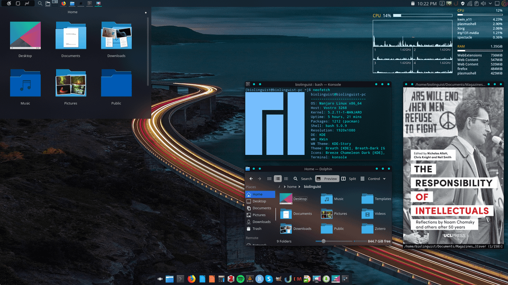
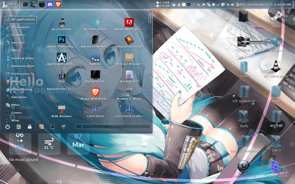
(not mine, found on image search)

It’s pretty easy! This is my desktop right now. I do like it a liiitle less gaudy and my mac use at work means that I prefer my window controls on the left instead of the right.
first screenshot doesn’t look like aero at all tbh. second one more so. this is the most accurate port I know of tho https://gitgud.io/wackyideas/aerothemeplasma
This is the kind of thing I had in mind!
Aero is more than just the blur effect, modern OS’s still have that in spades.
i want to install plasma just for this now
Skip aero. Let’s go back to compiz fusion and deskcubes.
New KDE brought the cube back!
Have a look at Wayfire. It’s a Wayland compositor that implements a lot of the compiz effects/plugins. I recently found that but haven’t tried it myself as I don’t really care about wobbly windows and cubes as much as I did 15+ years ago when I first tried compiz as a teenager :D
I’m rocking a desktop octagon with two monitors with all the fancy window animations on and still using less ram that windows on idle lol.
Oh fuck. We need themes on steam client
You can. They are called skins though.
Apparently official skin support no longer exists but Millennium for Steam looks like an unofficial tool that can be used for skins.
Yeah, I used to mess about with it but it became too much because Steam updates so damn much.
Needs to be running on Linux to make it perfect.
Well atleast for Gnome we have AdwSteamGTK which make Steam fit seemingly into LibAdwaita.
I think I speak for everyone when I say
NOOOOOOOOOOOOOOOOOOOOOO!!!
 A better timeline?
Windows UI design peaked with Windows 98 and Unix UI design peaked with IRIX imo
Back when they had consistent style guidelines to follow (I remember reading them, along with deep descriptions of how PnP actually works - yuck!).
Now they just throw shit at the wall it seems
Perfect choice of game to display this
10/10
I don’t know how to feel about this.
It’s making my micro soft
This just hits hard
I don’t get it. /g
I believe it’s a fantasy/for funsies mock-up of what the gaming store/launcher application Steam maybe could have looked like if it was done in a style similar to Windows 7’s styling and other computer applications and websites during that era. Looks like maybe MySpace and Windows Live Messenger may have been some inspiration
I hope that helps. I may be leaving stuff out or wording things oddly since I’m pretty brain foggy due to health issues, but no one had answered ya (that I can see) and I wanted to try to help ya out 😅
Thank you very much for willing to help, I hope you’re okay! 🤗
P.S.: I’ve seen your other comments (forgive me if that bothers you) and I would like to say that you’re an amazing person! I like how you always treat others with respect and kindness, this world surely needs more people like you! Please don’t forget to take care of yourself and remember that you’re loved! 👋
Thanks, I hate it.
