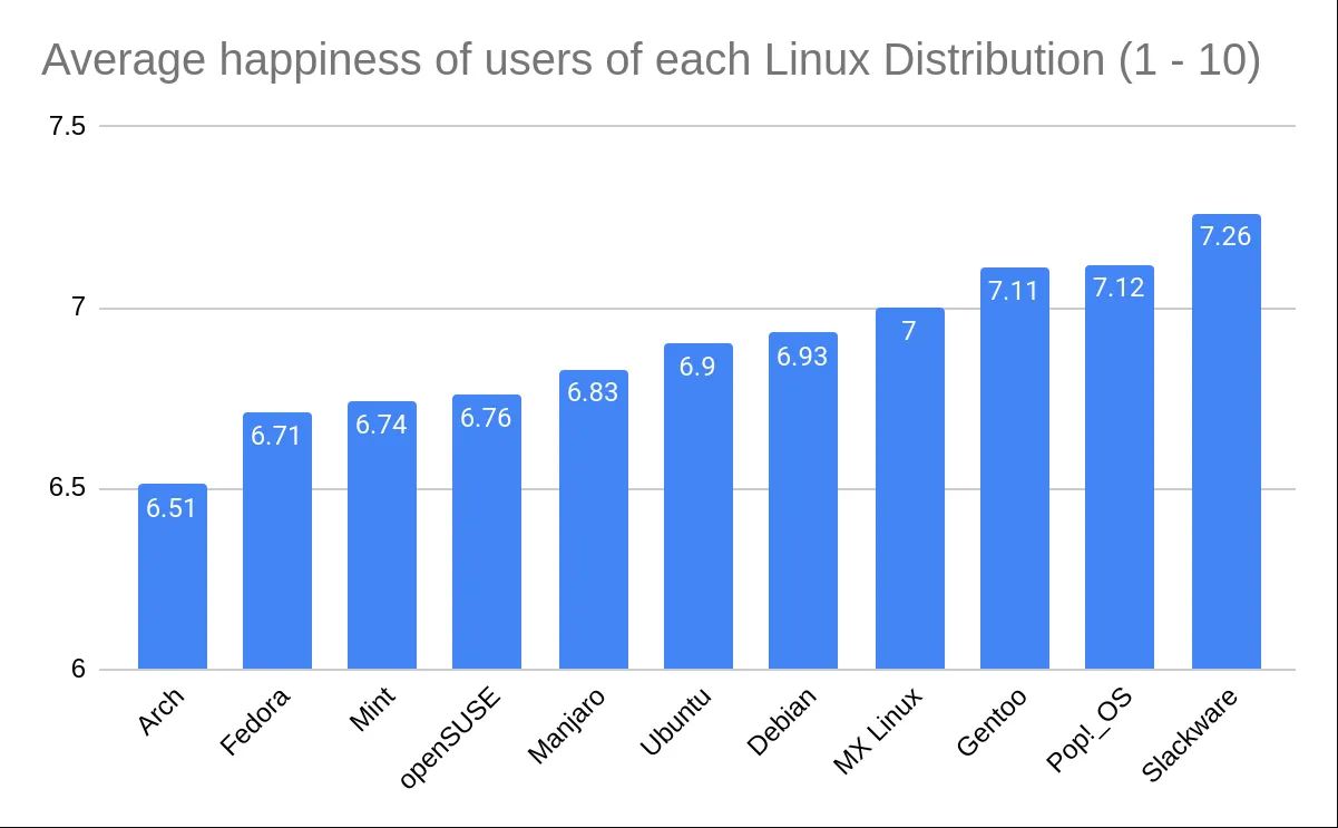
Just to kind of demonstrate that idea, I’ve recreated the graph in Excel with the axis starting at 0. I think Excel might actually be to blame for this happening so much, its auto selection actually wanted to pick 6, gross.
This is indeed misleading. It has no numerical figures, and it wastes loads of ink and screen space. The other one is better structured as a chart. I a sorry you spent your time to demonstrate something we all know, but may be Excel has good reasons that cuts off the axis at 6.

Fair. You know these figures right out from the graph don’t you?
Just to kind of demonstrate that idea, I’ve recreated the graph in Excel with the axis starting at 0. I think Excel might actually be to blame for this happening so much, its auto selection actually wanted to pick 6, gross.
This is indeed misleading. It has no numerical figures, and it wastes loads of ink and screen space. The other one is better structured as a chart. I a sorry you spent your time to demonstrate something we all know, but may be Excel has good reasons that cuts off the axis at 6.