

You must log in or register to comment.
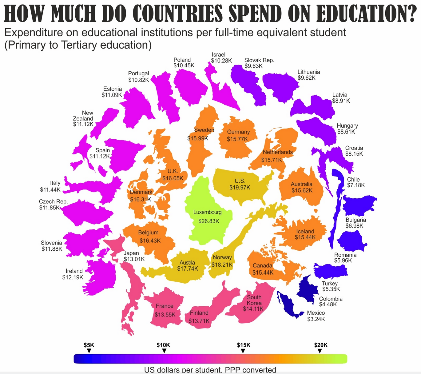
Canadian average is about 1 or 2 thousand less than that from the last info I could find a few weeks ago
I’d much rather look a simple sorted table or a bar chart.
For me the country outlines don’t add anything of value and they aren’t too scale either with arbitrary rotations mixed in. Spending is on a strictly one dimensional scale yet the graphic implies some concentric (2-dimensional) pattern.