It’s that phenomenon where people who endured trauma to attain something expect others to also endure the trauma.
I’ve tried learning GIMP, and it sucks. I’m not saying GIMP sucks, but you have to be crazy to not see that it’s hard to learn.
I’ve tried learning GIMP, and it sucks. I’m not saying GIMP sucks, but you have to be crazy to not see that it’s hard to learn.
I use GIMP for memes and here’s my two favorite tips
-
Hit the forward slash key
/to open a command palette and jump to any action -
To remove backgrounds, use a layer mask. select around the object and paint a white/black section on the layer mask. Here comes the trick: use a Gaussian filter on the layer mask to create a transition from black to white and the crop job looks a lot less choppy.
My anti-tip
- Adding text and shapes sucks and I never found a way to make it better. Export your image and finish the job in Krita, Pinta, Photopea, …
fuck, i neverthought of the gaussian blur thing, i always just traced over the edge with a soft edged brush…
I used the Blur Border (or whatever it’s called) option that’s right there in every selection tool’s settings.
Feather?
Smart people use terms like gaussian blur to refer to a blur distribution rather than a non technical term such as feather. Feathers are what helps birds fly for example. Let’s try:
“You can feather the pedals on your car to make it drift.”
“You can feather the pedals on your Ford to make it do the Tokyo style turns.”
Which sentence was better 😂?
-
Photoshop is also hard to learn. What’s your point? Just because it’s different to what you used to does not means it’s more or less difficult to learn.
I’m not used to photoshop so I can’t say anything about that.
I was a big fan of paint.NET but now that I stopped using Windows, it’s the only software that I really miss.
It had fewer features than GIMP, but it was so intuitive yet surprisingly powerful.
Have not found a similarly amazing alrernative, I wish Wine could make it work…
Does it run with WINE? iirc it was used a lot as an example for wine on android because it supported windows-on-arm
Not vonly hard to learn, it lacks some really basic stuff like undestructive ediring (adjusment layers) and such.
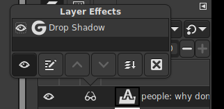
I am using 2.99.18 (non release, unstable build). Non destructive editing has landed. You can make adjustments through the usual menus and then enable/disable the adjustment under layer effects.

Wow, that’s greate!
OHH it even works with text layers!!! you can finally add drop shadow to a text without discarding the text information! ;A:

The sudden South Indian accent surprised me (vonly)
I’ve tried learning GIMP, and it sucks. I’m not saying GIMP sucks, but you have to be crazy to not see that it’s hard to learn.
“Im not saying it sucks but it does” How do you want us to take you seriously when you don’t even agree with yourself ?
They didn’t say GIMP itself sucks, they said leaning to use it sucks. Those are two different things.
anyone who has ever used image editing software professionally knows gimp’s ui sucks very much.
we could have had an opensource photoshop killer if the developers werent adamant to keep the 90s workflow holding it back for so damn long.
“you are using it wrong!!” my ass.
deleted by creator
I mean, there’s something to be said about adhering to an industry standard. Of course no project has to do so if they don’t want to, but people trying to get on with their work don’t want to spend a bunch of time relearning everything. I think Blender really thrived when they loosened up a little on their ideas of what a workflow should be and gave people industry standard options out of the gate.
Whether we like it or not, GIMP isn’t going to be most people’s first experience with image manipulation. Whether they had a free PS license through school/work, had a subscription at some point, or once got it through ahem alternative means, people will be coming into GIMP with certain expectation of what the workflow should look like and will get frustrated pretty quickly.
we saw a similar thing with blender, everyone kept shitting their pants over blender, until studios started actually using it, and then nobody cared.
Most of the complaints are just people mad that they have to learn something. As is true for most things in life.
Blender has also undergone multiple UI changes over the years to make it more usable for new people.
I dunno if it was you asking the question or not but ^^;; if you want some decent replacements for gimp I recommend krita, it’s more Photoshop like and honestly it’s my go-to however there is also photopea which is a browser editor that I heard is actually pretty good, and if you’re on Mac or Windows (if so I dunno why you’d post here XD) I recommend the Affinity suit, it’s cheaper than Photoshop and it’s a one time payment instead of a subscription.
I was just lurking, but I appreciate you sharing your knowledge and I like your use of the ^^;; and XD emojis :3
It looks like this was asked in a GIMP forum, so I’m not really surprised at the backlash. It’s super rude to ask that in that forum. Like, they shouldn’t be rude back, but I understand why they were.
Is it? It’s just a forum it’s not like he’s asking the devs
I’ve tried using GIMP and it absolutely sucks and I wish there was a good paint.net replacement.
Something I found about a lot of open source projects is that the UI is always terrible
I use https://www.photopea.com/. It is an online editor and never disappointed me.
I honestly think it’s unfair to judge someone for not putting significant time into learning another complex program. I’ve used Photoshop since it first existed, and it’s basically a lifetime of knowledge. A combination of things has brought me to exploring other open source solutions, but GIMP is definitely unintuitive in comparison. I’m only putting the time in because there’s literally no alternative that’s as powerful and ubiquitous an image editing solution, but I’d also be the first to jump on alternatives that would make the transition easier. It’s especially not fair to cast that judgement on professionals who don’t really have the time to invest in learning a new tool from scratch.
inkscape in my opinion is intuitive to use, maybe because before I was used to Photoshop
many such cases. good to call it out, and needs to happen more often and consistently as toxicity is the #1 barrier to the “year of the Linux desktop” in my experience
edit: also https://krita.org/
Krita is really good for digital drawing and painting, but photoshop does cover a lot of other things, which krita can not do. In that sense Krita is more of a Corel PaintShop Pro alternative. While GIMP is the best, but still very bad, alternative to photoshop.
I feel like it would be helpful to include the text of their post rather than just the title:
TL;DR Sorry if this is wrong group. GIMP = Epic POS. Do not use. Please recommend a decent alternative. Don’t waste your time with GIMP help because I am done.
I hope the mods or the bots don’t kill this post right away. It’s a serious and legitimate question from a UX designer with several decades of experience, who doesn’t want anyone else to suffer what I have. I didn’t know where else to post it, so I’m trying here as a first-timer. I apologize if this is not in the spirit of the group.
I quit Adobe, can’t afford the price any more (long story). I thought GIMP could replace Photoshop. But the user interface is horrible, and the app is full o’ bugs.
Here’s the straw that broke the camel’s back.
I tried to make a meme. The font selection overlay was a tiny, pathetic, hard to read joke. Not even a font selection dropdown, let alone one that provided previews with every line item like PS does. Deep breath, continue. I type “Impact”. Red text. I backspaced and typed “Im”. All I got was Impact Condensed. (Yes, I have Impact, and have used it in PS). So I picked it anyway. Then I tried to find the outline font feature. In Photoshop, it’s a simple “choose stroke” feature. GIMP? Hello?
I want to the Web to find a tutorial where it pointed out the feature. No luck. Searched again to find a workaround / hack. Mostly crap. Found one that was current and seemed decent. Followed it carefully. GIMP crashed.
While I appreciate the thoughts of anyone who may be compelled to point out a simple workaround or feature that I missed, don’t bother. This is the last of many dozens of problems I have wasted my time working around while suffering many crashes, and I already uninstalled it.
So. Recommendations?
I think it’s also worth giving the correction that there is a font selection dropdown with previews in GIMP. It’s to the left of the font input box.
I use gimp but OP isn’t wrong. Doing a stroke on text is mindless in Photoshop and very convoluted in gimp.
I’m annoyed no one ever bothers to mention this:
because it’s illegal
To be fair, you can’t exactly ask for a GIMP replacement on r/GIMP and not expect that reaction
Sure you can.
Gimp isn’t perfect. But neither is Photoshop. In fact Lightroom users grizzle that Photoshop is so much harder to use than Lightroom. It’s a different animal.
I use Pinta or Paint.Net when I want a quick edit. But Gimp has the tools for serious editing. More tools, more hard to use.
Some Gimp things, yes! should be improved. And other things are being improved as we speak. And some things can be done on a photo much easier in Inkscape.
I hope the whiners donated to Gimp development? No? Then just please step back, and think for a bit. If thinking is too hard, then just take a deep breath.
Donating to GIMP will not likely make it user-friendly enough to make me use it unless absolutely forced to. I would much rather donate to Pinta or Paint.NET or something where development would actually benefit me.


