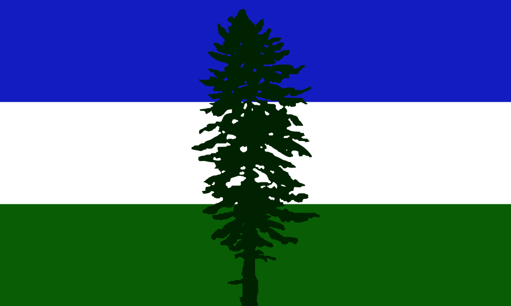
here’s my terrible canvas logo
You must log in or register to comment.
I wouldn’t change a pixel of that. Perfect.
Agreed!
The only options are either keep it exactly as is or faithfully recreate it on the canvas. It perfectly represents the spirit of Canvas in a way a more polished/“good” logo never could
We need a half drawn pony with a German flag running over it…
How would the last canvas be as the header?
ya know, that’s a good idea
done 👍


