Hi Mlem Community,
We’ve been quiet recently, but that doesn’t mean we haven’t been busy! Our development efforts over the last few months have been primarily focused on our 2.0 build. This is a ground-up rebuild, which is no small undertaking. We’ve solidified our backend groundwork, and are now well into rebuilding the UI with a clear roadmap to an early TestFlight beta.
As we mentioned in April, We’re also taking the opportunity to move the app from Lionel Hanners’ account to mine. Doing this requires shutting down the TestFlight, and since we aren’t planning any major releases against the v1 codebase, we’re going to keep it down until 2.0 is ready for beta testing.
Roadmap
We want to get 2.0 into your hands as quickly as we can, and so we’re planning to ship a TestFlight as soon as we have a minimal working feature set for daily use. That feature set is:
- All non-moderator feed options
- All (DONE)
- Local (DONE)
- Subscribed (DONE)
- Saved (IN PROGRESS)
- Community (IN PROGRESS)
- Profile (IN PROGRESS)
- Search (IN PROGRESS)
- Non-moderator Inbox
- View replies/mentions/messages (DONE)
- Reply to items (IN PROGRESS)
- Reports (IN PROGRESS)
- Account deletion (IN PROGRESS)
Bonus features:
- A brand new post layout option
- Full support for Lemmy’s custom Markdown dialect
- Color themes
- Guest mode
- Sort community list by instance
We also have a few features we’re making good progress on and hope to have in the 2.0 release, but might come a little later:
- Basic video handling (videos play properly, tap to play/pause) (IN PROGRESS)
- Improved iPad UX (IN PROGRESS)
We’ll put out an announcement when the new TestFlight takes off with a link to join, and keep this post (roughly) up-to-date with development.
Cheers,
For those (like me) that exclusively browse Lemmy on the Mlem TestFlight - what will this mean? Will I have to swap clients temporarily while the TestFlight is offline?
If you want to keep using Mlem while the TestFlight is down, you can just download it from the App Store–the current release build is identical to the TestFlight, and should keep all your preferences.
I did this and it kept my preferences, for your edification and anyone else finding this comment.
D’oh, I forgot there was an actual release, lol. Thanks for the response!
Markdown support, you say? I’m totally in. Can’t wait. This is my favorite Lemmy client and that’s coming from someone who loved Apollo and Voyager is a great replacement for.
And maybe a little iPad layout love for little old TheRealCharlesEames?
I would like some iPad love too. Especially the crash bug when switching apps.
Mlem v2 is a completely different codebase to Mlem v1, so bugs that exist on v1 are likely to be fixed in v2. We’re aware of an Mlem v1 crash that occurs on iPad when Face ID Unlock is enabled - this is unfortunately difficult to fix because of the way Face ID Unlock works.
In iOS 18, Apple is introducing native support for Face ID Unlock in any app. This makes our own system redundant, so we’ll be removing our version of the feature in favor of the more reliable iOS equivalent.
Thank you. And I know I harp on the iPad crash bug a lot, but that is because I use Mlem mostly on iPad. That said, I greatly appreciate your work and the amazing app! Keep up the good work please.
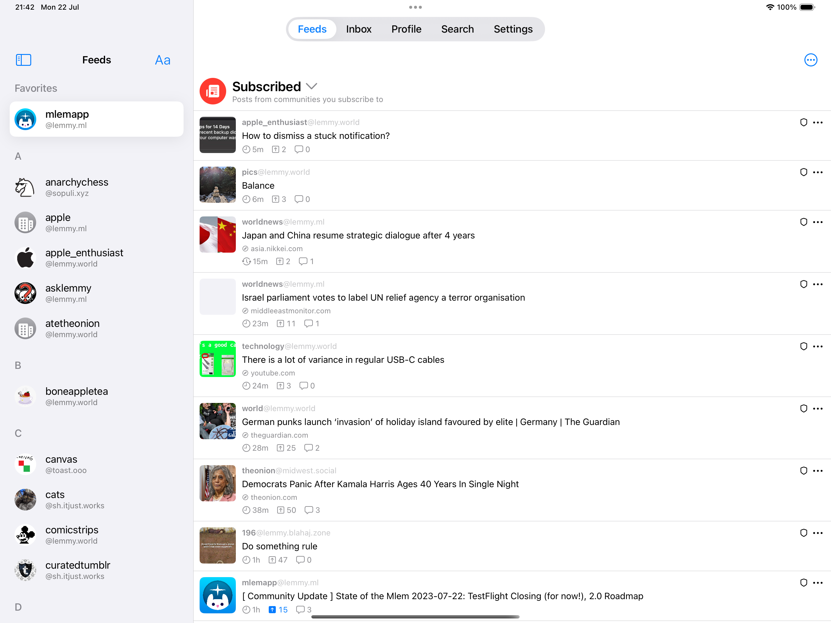
We’re making several quality-of-life tweaks to the iPad layout in 2.0! So far, we’ve made the image viewer full-screen and updated the sidebar to look a bit more modern. Here’s a sneak peek:

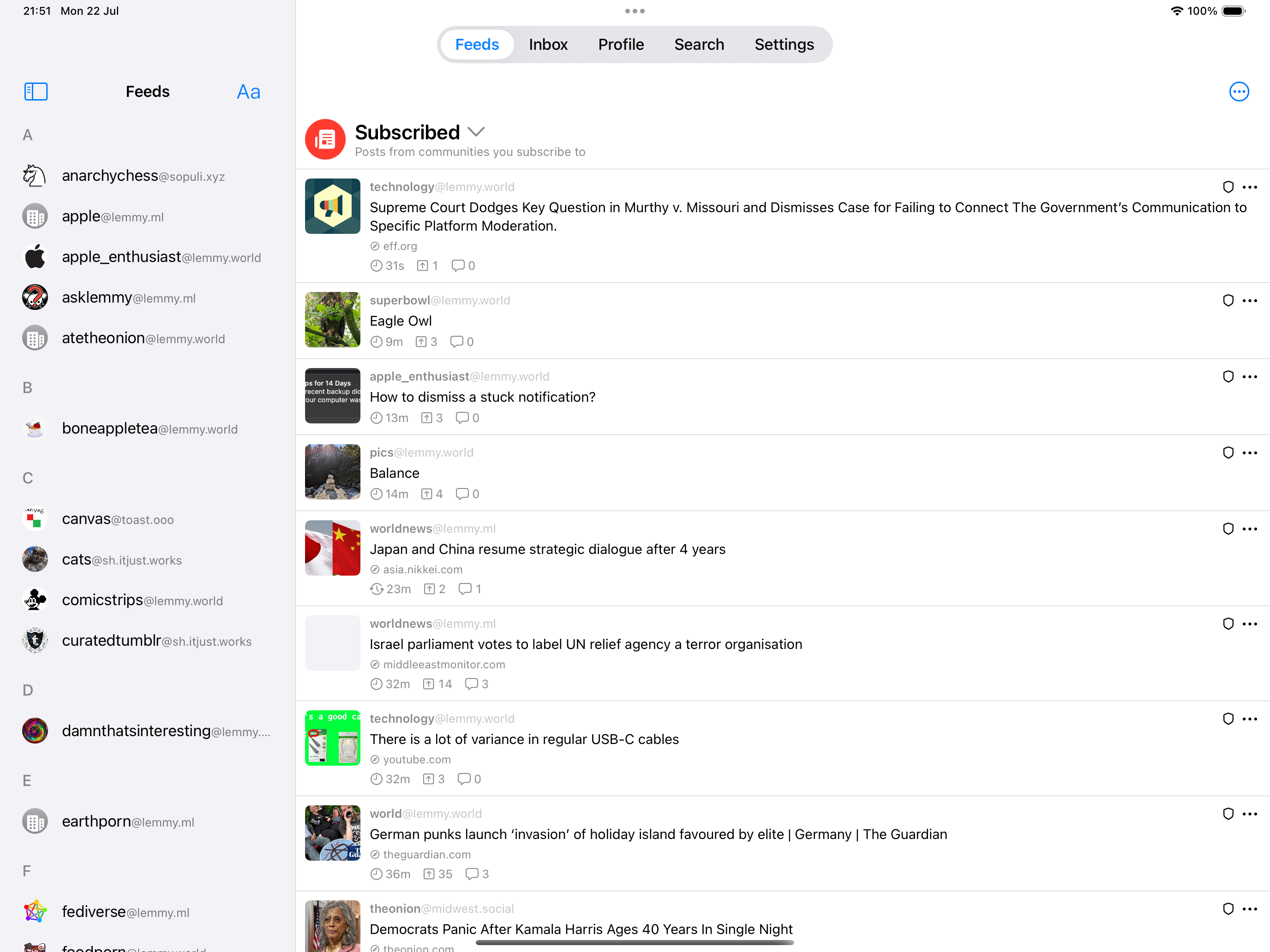
There’s also a setting for a more compact sidebar layout, if you prefer that:

(This is all WIP, it might change. Ignore the lack of All/Local/Subscribed buttons, those will be back in before the first TestFlight).
We’re also adding a setting that displays posts in a grid with two or more columns, which will make the posts look less wide in this format.
Longer-term we’re considering some ways that we can improve the iPad layout as a whole - such as having a three-column layout - but there’s some navigation problems to work out and we can’t promise that anything like that will be in 2.0.
Nice work. Please give the feed some left and right padding. The lack of space gives me anxiety (and makes the design look amateur). Thanks for sharing!
Looks good, I like this layout preview 😊
Is searching by post planned for 2.0? That’s the only feature I’m missing from Mlem right now 🙏
Yes, searching for posts and comments will be in 2.0!
Let’s go! That will perfect the app!
Keep up the good work!
Thank you for your work and effort to improve on Mlem, I like this app and it is great to see that we will have a new foundation soon for even more features to come.


